Today is a short one, I want to talk a bit about interactivity and adding highlights to visualize that entities are interactive.
I've finally implemented proper modular buildings, which can be built piece by piece! In short, walls, doors, floors, and roofs can be placed individually. The game will then figure out which parts belong together to form a single building. Knowing that, the game will automatically hide walls, roofs, and the interior. Depending on whether the player is walking inside a building or behind it.
But more about building houses another day.
Given that, it was time to be able to see if and when an entity is interactive.
I tested out multiple ways to visualize something being interactive from:
- Re-drawing the same object twice with additive blending
- Drawing a translucent white silhouette of the object on top of it
- Rendering an outline on the entity
The middle one is pretty self-explanatory, it's the outline.
The left and right versions are a bit harder to spot the differences between. The left one is the door rendered again on top, but using additive blending. The right one is a translucent white silhouette version of the door rendered on top.
The right one looks a bit "washed out", everything is overall just the same translucent white. Whereas the left one retains the original colors more. The gray door handle turns lighter, while the black edges of the door remain darker.
The different visualizations had different downsides.
Translucent White Silhouette:
Drawing a translucent white silhouette was definitely the easiest, as it essentially only required tinting all the pixels of the sprite to white.
There's also a lazier solution, which is to use a stencil buffer, following by drawing a white quad covering the sprite. However, using the stencil buffer "just" for that seems a bit overkill. Additionally, it also requires splitting entity rendering into additional separate draw calls.
Additive Blending:
The downside to additive blending, besides also having to split entity rendering into additional separate draw calls. Is that color changes can be quite extreme. Darker colors visually change less, while inversely the ligher colors change a lot.
Given that the game uses a lot of dark and saturated colors, then using additive blending might end up being hard to see.
Outline:
Using an outline essentially doesn't require any (major) changes to the rendering. In short, it is technically just another sprite rendered on top of the entity.
However, a downside is that it requires drawing outline versions of all interactive entities.
That being said, for entities which have a clear (literal) outline, then the outlined versions can somewhat be algorithmically generated. By literally tracing an outline around an entity.
Besides having to draw all the outlined version of all interactive entities, then they also have to be loaded. Some versions are potentially the same size or even bigger, than the original sprite. Which can potentially double the needed texture space for entities.
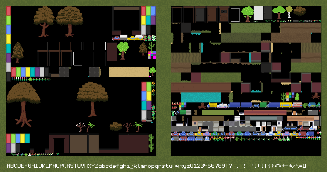
Currently when the game starts, it loads all sprites into multiple tightly packed texture atlases.
Notice on the left texture atlas, how the (white) door frame outline is the same size as the open door itself.

Ignore the duplicate textures and old textures, currently I'm loading a lot of different things, just for testing.
Additionally, notice the empty areas next to the trees. Those areas aren't actually empty, but actually the shadow versions of the trees. However, compared to tree shadows, then the shadows are used quite frequently. Whereas the outlined versions of entities are not. At most a single outlined version is used and rendered at any time.
Given that, I'm considering separating all outlines into a single tiny texture. Where the outline for the currently interactive entity is uploaded dynamically to the GPU when needed. Instead of storing a texture atlas of all entity outlines.
This will at least save texture space on the GPU-side. While not being expensive to upload to the GPU on demand, as the interactive entity doesn't change that frequently. While also at most being a single entity at a time.
Ultimately, I received the most positive feedback for outlines, which I also preferred the most myself. I find outlines are the most readable out of those I tested. Adding an outline made it clear which part is interactive, instead of just highlighting the whole object. Additionally, highlighting the whole object felt quite "extreme" and in-your-face.
Thanks for reading! Feel free to leave a comment through any of the following links:
