Hello, and welcome to the second devlog!
Sunflower field in the middle of a forest (Click here to see still image)
The last two weeks, I've been working on various things, some of which are:
- Reworked the world generation
- Prepared world generation for structures (e.g. cities), where a structure can span across multiple chunks
- Continued experimenting with road generation, such that roads between generated cities across the whole world can be predictably connected
- Created way too many new character designs
- Redrawn various graphics to fit the new scale everything is at
- Overall, just making a lot of new graphics
Today, I want to talk more about the thought process behind making all the graphics. Specifically, about some of the rules and requirements I'm putting on the graphics, as well as rendering them in-game.
In short, there's 3:
- 1 pixel is 1 pixel - i.e. no non-uniform in-engine scaling between graphics
- Keep somewhat proper proportions - i.e. the size of a person vs a bird vs a car, should follow somewhat proper proportions
- Minimal in-engine rotation or shearing - transforming sprites can easily mess with the look of everything
The first requirement is straightforward to follow, as it requires doing absolutely nothing. At least from the in-engine rendering perspective. Simply render all sprites with their exact dimensions. The only scaling done should be applied to the camera, in the form of a camera zoom. This ensures everything is uniformly scaled, and the first requirement is successfully followed!
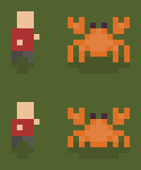
Now, if we rewind back to the 7th of August the first animal I added to the game was a crab. (An ode to the fact that the game is implemented in Rust.)

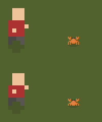
However, if we compare the crab to the player, then it becomes immediately apparent that the second requirement is being broken. The crab is practically the height of the player and overall significantly bigger. This clearly by no means follows the proper proportions of a person in relation to a crab. (Assuming a tiny normal sized crab, and not some big monster crab.)
An easy way to fix the proportions, would be to simply scale down the crab, when it's being rendered in-game. However, by doing so we would break the first requirement, that 1 pixel is 1 pixel.
Rescaling pixel art results in a look and feel of inconsistently-sized pixels, which can feel somewhat off. In the pixel art community this is referred to as "mixels".

This is where the tricky part comes in. If we want to follow both requirements, then we need to somewhat know beforehand, what the smallest thing in the game will be. Such that we can allocate a high enough minimum pixel "budget" for the smallest things. That way the smallest things can be represented, while bigger things can be made proportional to them.
If the smallest thing in the game is the player character, then we could make a character who is 5x10 pixels. However, if we then later want to make a bird which follows proper proportions, then we might only have one-third or one-fourth of the player height to make that bird. This would get even worse, if we later wanted to make a mouse as well, as we'd likely only have 1 or 2 pixels to represent it with. While that could work for some art styles, I want each sprite to be more discernible by themselves.
Even after that, picking a small thing as a baseline, say as a bird. Those birds can be made using a few pixels, or a bit more detailed. All in all, this is quite tricky. Especially, given that my experience with pixel art is quite limited. I do however, have a certain look and feel in my head, that I'm going for. Overall I'm going for a more dystopian, nitty-gritty, and desaturated style. However, when it comes to the sizes of everything, I'm currently trying different sizes to see what speaks the most to me.
Talking about birds, I made a few the other day!

The issue was just...
I had also created a new-but-unfinished player character a few days earlier. However, when I looked at it (the silhouette) next to the birds, it's very clear that the birds need to be smaller or the player needs to be bigger.
The third and last requirement, is to do minimal-to-no in-engine rotation or shearing of sprites. Besides it easily being another source of mixels. Then overall, I just want to keep the aesthetic of consistent pixel sizes, and having everything properly aligned in relation to an overall pixel grid.
Additionally, instead of just rotating sprites. I really want animations, where having animations seems like the appropriate thing to have.
For instance, back on the 12th of August I made some very crude falling tree animations. Technically, in that same clip, shearing is also applied to the shadows. However, I did say minimal use of rotation and shearing, not no use rotation or shearing at all. In the case of shadows, it seemed fitting, without creating any jarring results.
That being said, after redrawing the trees, I feel like making falling animations for all of them, is going to be highly time-consuming. So when I get around to updating tree chopping for the new trees, then I'll likely make them "poof" while spawning logs, twigs, and whatnot. At least for now.
Currently, one of the exceptions where I'm rotating sprites is the player's weapon. Having weapons only face a few fixed directions feels off. So instead they are currently rotated to face towards the mouse cursor directly. I'm considering testing out pixel-perfect rotations in real-time in the future.
In the end, these requirements are overall completely fluid and simply guidelines for making the game. They came naturally based on the style and aesthetic I'm going for. They were previously completely subconscious and now they're put in writing.
Now, is any of this is going to be true in a month or half a year? Who knows.
All in all, I'm experimenting with the graphics until I'm able to fulfill the aesthetic I have in mind, and I will keep iterating on it until it feels right.
 9th of September vs 10th of October
While making all the graphics so far, has been quite the rollercoaster, given that I'm continuously discarding and remaking a lot of it. In reality, while it's really time-consuming going back-and-forth a lot. I don't consider it a waste of time, as I'd prefer to keep remaking the graphics, until I finally reach the sweet spot.
I have considered more and more making technical posts as well. Besides just sharing news and changes of the game. I also want to share more technical details, about how some of the inner workings of the game is implemented.
Here's a few topics I have considered turning into posts:
- Rendering millions of tiles in real-time
- Procedural world generation - i.e. using noise and pseudo randomness to generate different biomes, rivers, placing trees and other entities, etc.
- Randomly generated buildings with random rooms and interiors
- Generating cities and roads in an infinite world
These posts will of course be written in relation to the game, and how those things are being done in the game.
I even started writing on some of them.
In other social media related news, besides posting on Reddit (/u/VallentinDev), Twitter/X (@VallentinDev), and Discord. I now also post on Mastodon, Tumblr, and Game Jolt.
Currently, I most frequently post on Twitter/X, which I mirror on Mastodon as well. I also frequently post random clips and screenshots on the Discord server I created for the game.
Thanks for reading! Feel free to leave a comment through any of the following links:
